A truly effective brand identity captures the company’s vision and connects it with its audience.
Brand design must reflect the client’s business unique qualities rather than showcasing the designer's individual style. This is the philosophy I embrace, where brand identities are crafted to be as distinctive as the clients they represent, creating designs that resonate and sustain impact.
Screen Solution Victoria
For Screen Solution Victoria (SSV), a Melbourne-based furniture manufacturer founded in 1997, the challenge was to evolve an outdated identity. Originally known for custom screen systems, SSV expanded its offerings to include workstations and storage systems for modern office environments. However, their legacy red and grey wordmark no longer reflected the company’s broader capabilities.
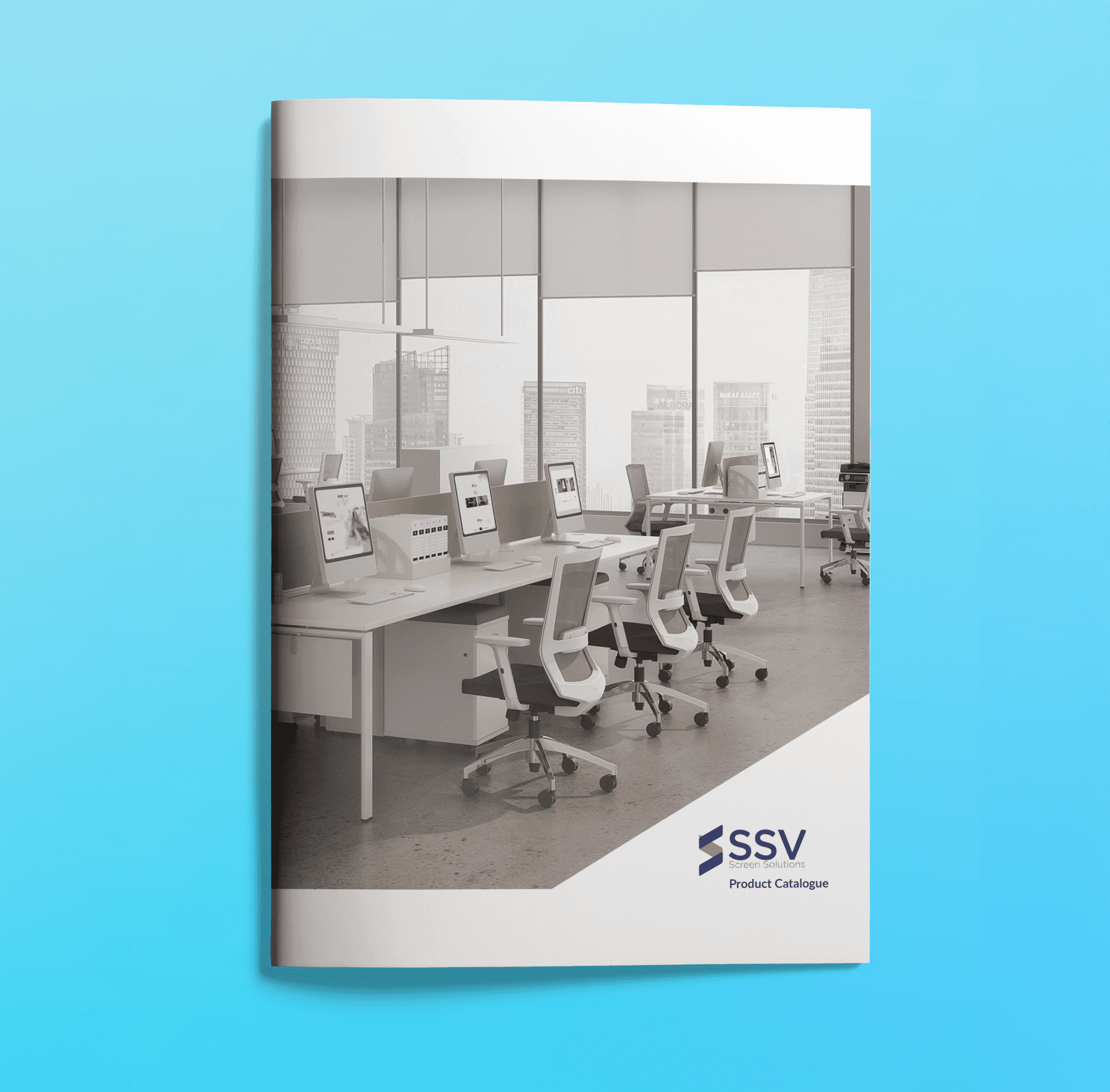
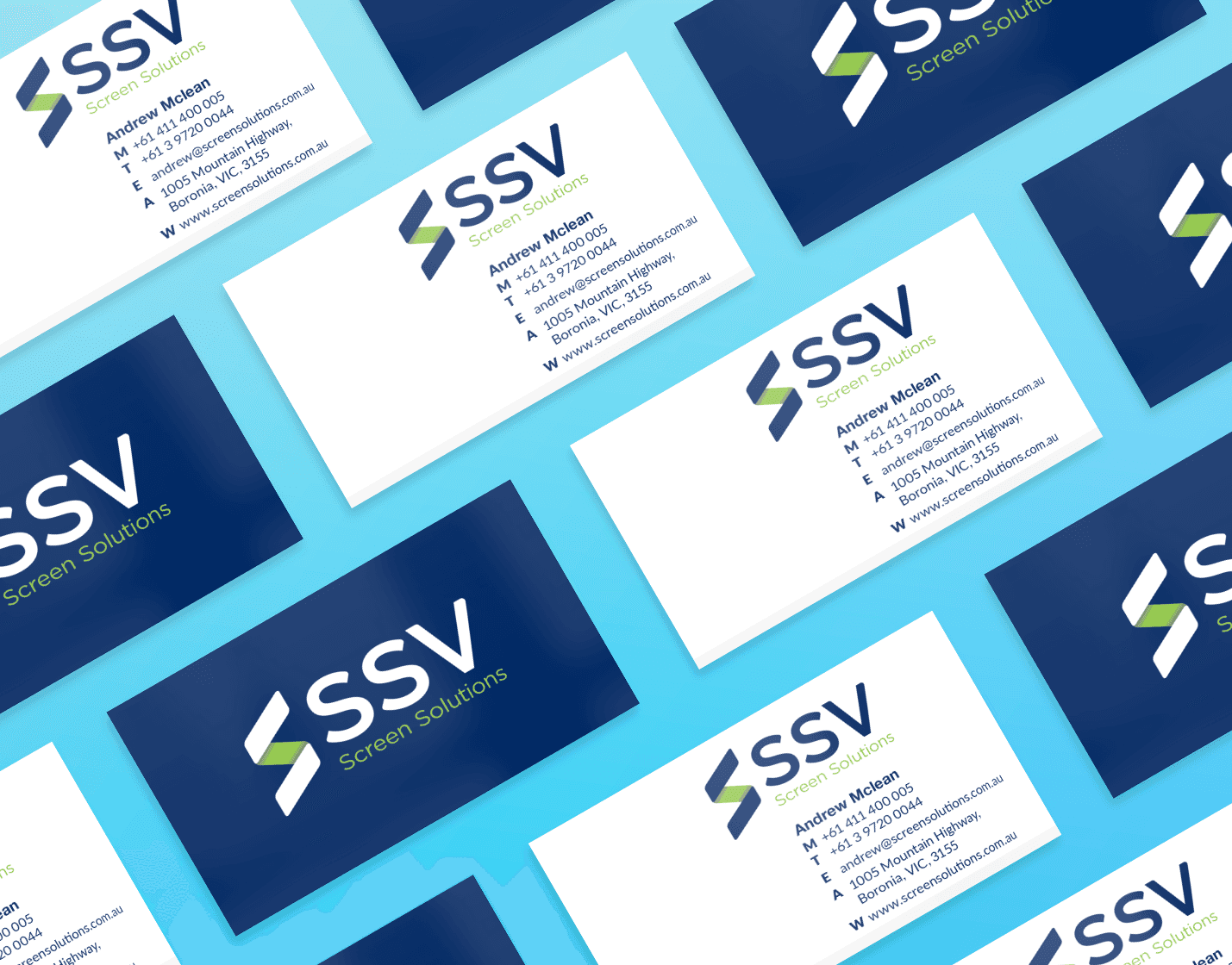
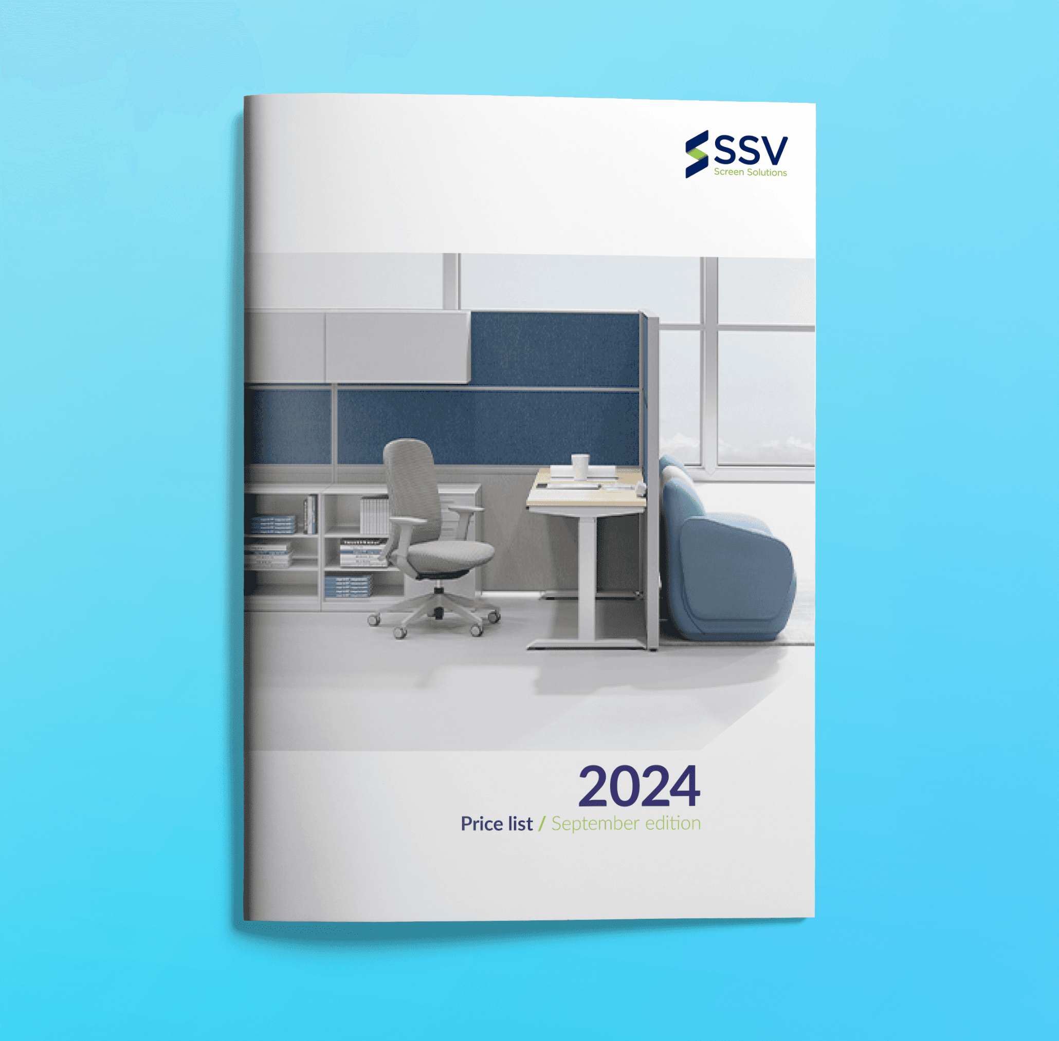
SSV needed a design that would bring them up-to-date. The client expressed a desire to move to SSV rather than the full name; in conversation, they and their clients almost always shortened the name. Words the client wanted to be associated with their new design were crisp, clean and simple. The client wanted a symbol to be used as a marque in screens and furniture if possible.
SSV needed a design that would bring them up-to-date. The client expressed a desire to move to SSV rather than the full name; in conversation, they and their clients almost always shortened the name. Words the client wanted to be associated with their new design were crisp, clean and simple. The client wanted a symbol to be used as a marque in screens and furniture if possible.
SSV needed a design that would bring them up-to-date. The client expressed a desire to move to SSV rather than the full name; in conversation, they and their clients almost always shortened the name. Words the client wanted to be associated with their new design were crisp, clean and simple. The client wanted a symbol to be used as a marque in screens and furniture if possible.
…the symbol became the foundation for the visual identity, using the angles to create visually interesting angles in printed collateral…
…the symbol became the foundation for the visual identity, using the angles to create visually interesting angles in printed collateral…
…the symbol became the foundation for the visual identity, using the angles to create visually interesting angles in printed collateral…
The design solutions I created revolved around a symbol that could be cast into the furniture. The colours were updated to more contemporary options. Some designs evolved the type in the existing wordmark to help build some recognition with the existing design, while others moved further away from the current. The manufacturing process was considered when designing the symbol. The simple design worked in relief and also in print. The symbol became the foundation for the visual identity, using the angles to create visually interesting angles in printed collateral.
The design solutions I created revolved around a symbol that could be cast into the furniture. The colours were updated to more contemporary options. Some designs evolved the type in the existing wordmark to help build some recognition with the existing design, while others moved further away from the current. The manufacturing process was considered when designing the symbol. The simple design worked in relief and also in print. The symbol became the foundation for the visual identity, using the angles to create visually interesting angles in printed collateral.
The design solutions I created revolved around a symbol that could be cast into the furniture. The colours were updated to more contemporary options. Some designs evolved the type in the existing wordmark to help build some recognition with the existing design, while others moved further away from the current. The manufacturing process was considered when designing the symbol. The simple design worked in relief and also in print. The symbol became the foundation for the visual identity, using the angles to create visually interesting angles in printed collateral.
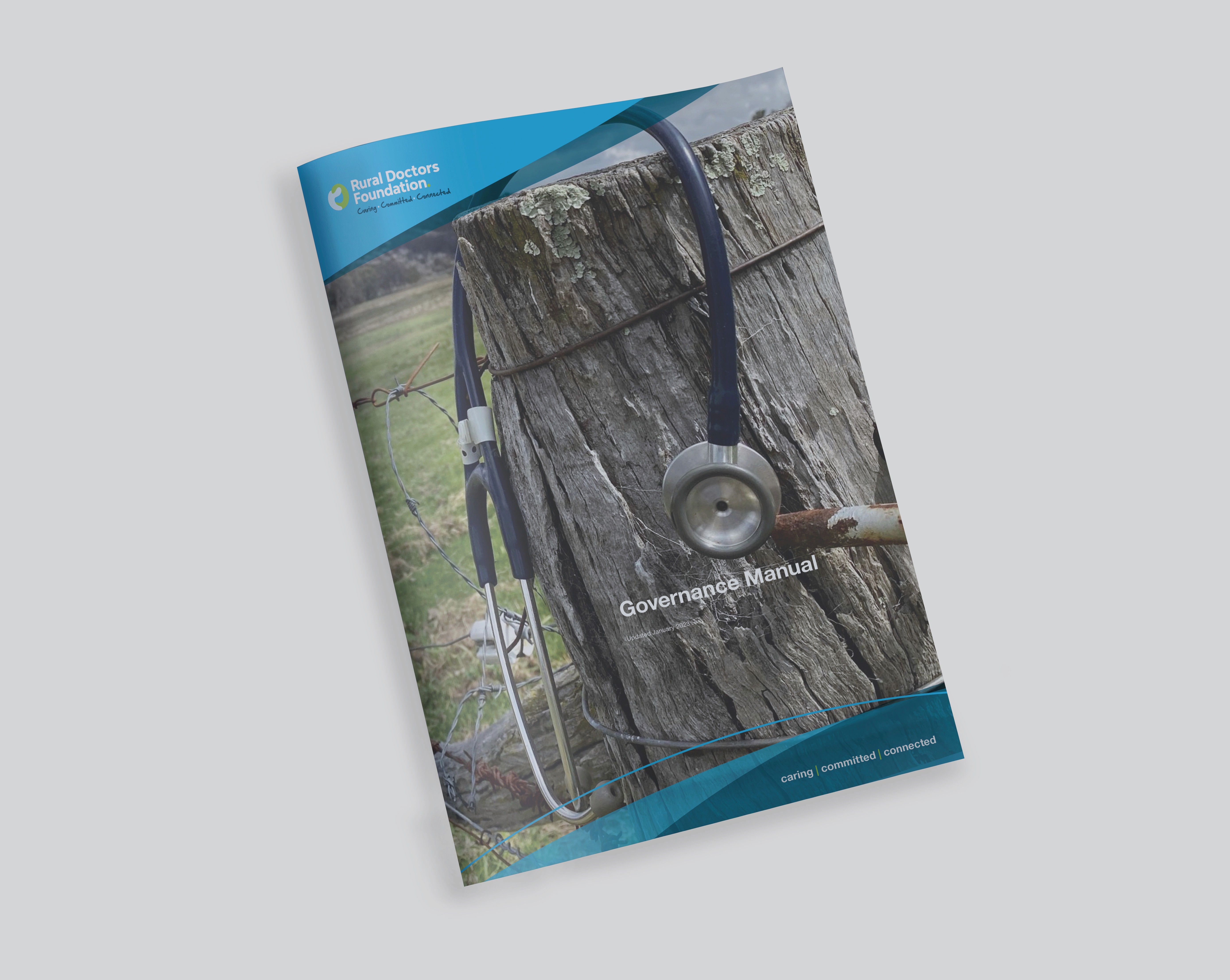
Rural Doctors Foundation
Rural Doctors Foundation
Rural Doctors Foundation
…they already had a logo, but it was just that, a logo. There was no visual identity…
…they already had a logo, but it was just that, a logo. There was no visual identity…
…they already had a logo, but it was just that, a logo. There was no visual identity…
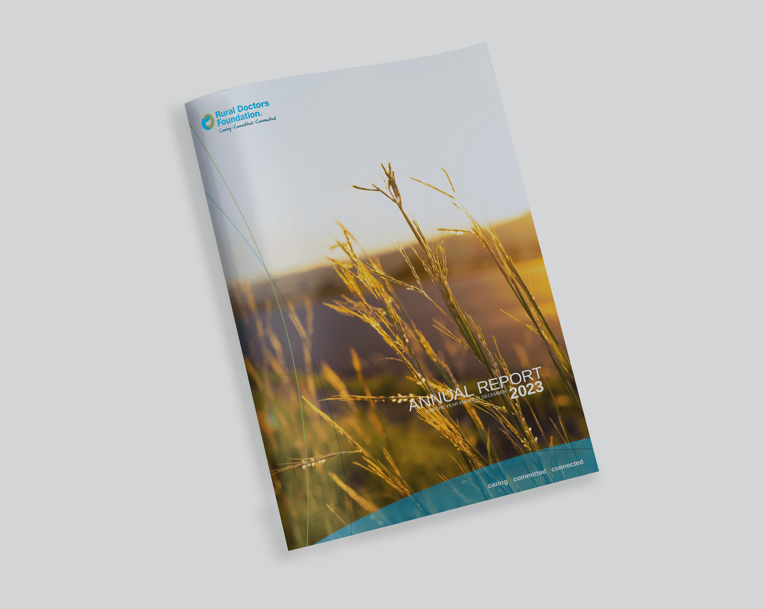
Not every branding project begins with the logo. Rural Doctors Foundation are a national organisation that supports doctors in rural Australia. Their mission is to help doctors maintain their health and stay in the communities where they play a vital role. The role of the Rural Doctors Foundation is to create initiatives that raise funds for rural doctors and programs to help maintain their health. They already had a logo, but it was just that, a logo. There was no visual identity. They needed a brand identity to help build brand recognition among stakeholders, such as practising doctors, patients or potential supporters, such as governments and major businesses. Using the logo as a starting point, the visual identity uses the flow of the curves in the design. A fluid identity was created where curves are layered to create a recognisable look. The fluid design allows designers to build individual designs with an overall brand look. The use of the logo colours in the visual identity further builds this recognition.
Not every branding project begins with the logo. Rural Doctors Foundation are a national organisation that supports doctors in rural Australia. Their mission is to help doctors maintain their health and stay in the communities where they play a vital role. The role of the Rural Doctors Foundation is to create initiatives that raise funds for rural doctors and programs to help maintain their health. They already had a logo, but it was just that, a logo. There was no visual identity. They needed a brand identity to help build brand recognition among stakeholders, such as practising doctors, patients or potential supporters, such as governments and major businesses. Using the logo as a starting point, the visual identity uses the flow of the curves in the design. A fluid identity was created where curves are layered to create a recognisable look. The fluid design allows designers to build individual designs with an overall brand look. The use of the logo colours in the visual identity further builds this recognition.
Not every branding project begins with the logo. Rural Doctors Foundation are a national organisation that supports doctors in rural Australia. Their mission is to help doctors maintain their health and stay in the communities where they play a vital role. The role of the Rural Doctors Foundation is to create initiatives that raise funds for rural doctors and programs to help maintain their health. They already had a logo, but it was just that, a logo. There was no visual identity. They needed a brand identity to help build brand recognition among stakeholders, such as practising doctors, patients or potential supporters, such as governments and major businesses. Using the logo as a starting point, the visual identity uses the flow of the curves in the design. A fluid identity was created where curves are layered to create a recognisable look. The fluid design allows designers to build individual designs with an overall brand look. The use of the logo colours in the visual identity further builds this recognition.


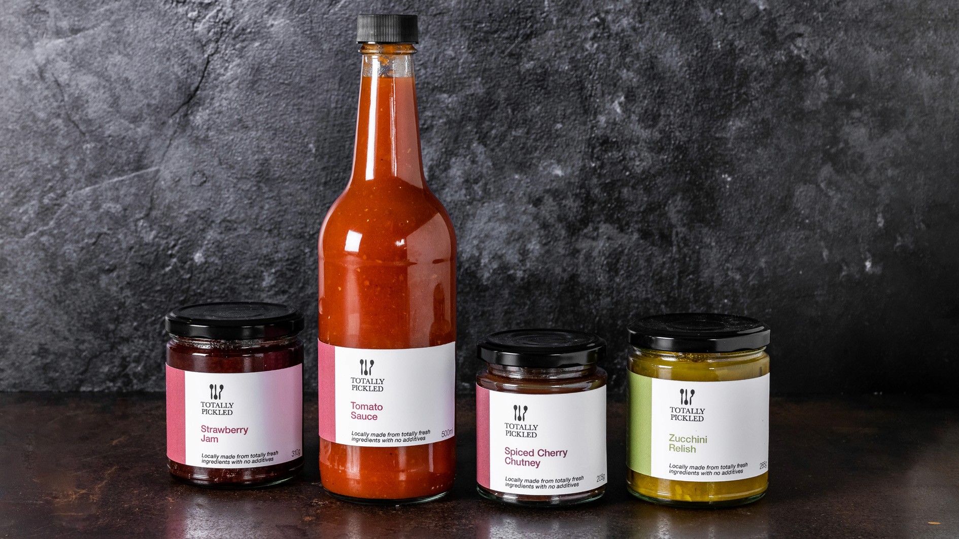
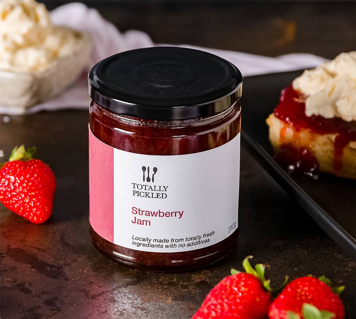
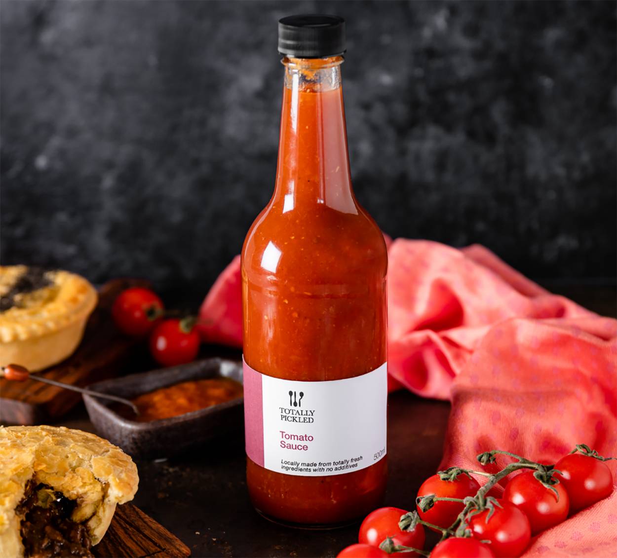
Totally Pickled
Totally Pickled began as a small venture where founder Sue Clarke shared her love of cooking through handmade jams and relishes. As her business evolved from farmers' markets to upscale food retailers, the packaging needed an update to reflect this growth and to appeal to a new, more refined audience.
The original design’s homey appeal – a cooking pot and spoon – was replaced with a more sophisticated look. The reimagined packaging features three spoons in a refined arrangement, alluding to the premium quality of the product and inspired by the culinary branding seen in high-end restaurants. This subtle nod to quality and professionalism aligns Totally Pickled with its new target market, effectively repositioning the brand for its next chapter.
The original design’s homey appeal – a cooking pot and spoon – was replaced with a more sophisticated look. The reimagined packaging features three spoons in a refined arrangement, alluding to the premium quality of the product and inspired by the culinary branding seen in high-end restaurants. This subtle nod to quality and professionalism aligns Totally Pickled with its new target market, effectively repositioning the brand for its next chapter.
The original design’s homey appeal – a cooking pot and spoon – was replaced with a more sophisticated look. The reimagined packaging features three spoons in a refined arrangement, alluding to the premium quality of the product and inspired by the culinary branding seen in high-end restaurants. This subtle nod to quality and professionalism aligns Totally Pickled with its new target market, effectively repositioning the brand for its next chapter.
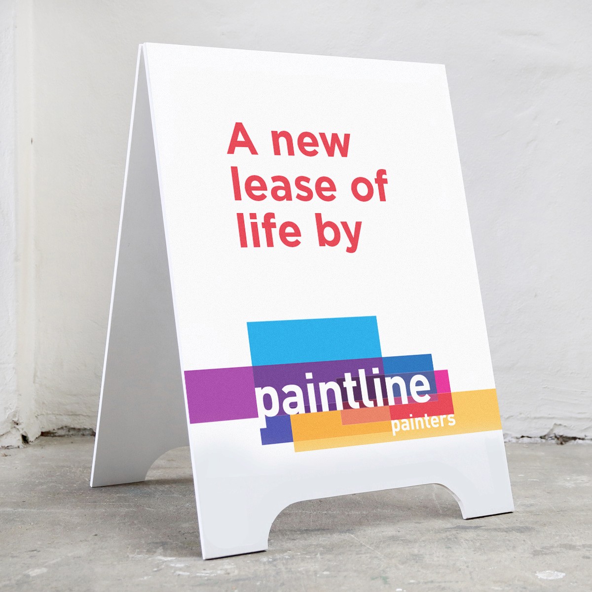
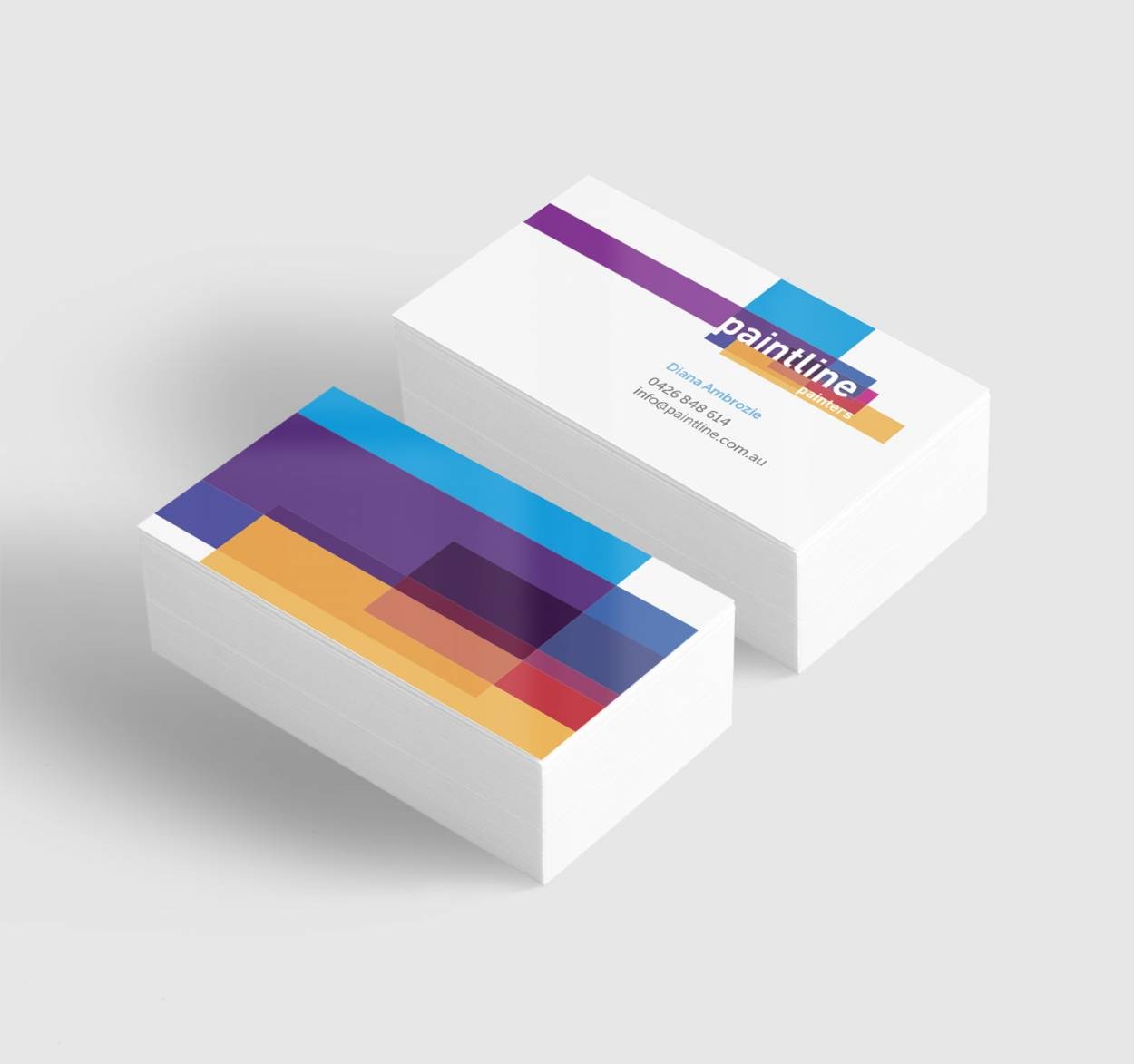
Paintline Painters
Like many small businesses, Paintline Painters started life with a generic logo. It was applied randomly from piece to piece. The design was a paint daub in black and yellow. With no guidelines, the logo was applied inconsistently from one piece of communication to the next by a series of different designers and the client.
The challenge was to create a colourful identity for a small business that works with colour every day. The design needed to make them more professional and be the starting point for a visual identity that would build brand recognition for the rapidly growing organisation. The client had said she would love a rainbow of colour, but didn’t want a rainbow. The idea was to create a flexible identity to fit with the different types of painting projects the client completed.
The challenge was to create a colourful identity for a small business that works with colour every day. The design needed to make them more professional and be the starting point for a visual identity that would build brand recognition for the rapidly growing organisation. The client had said she would love a rainbow of colour, but didn’t want a rainbow. The idea was to create a flexible identity to fit with the different types of painting projects the client completed.
The challenge was to create a colourful identity for a small business that works with colour every day. The design needed to make them more professional and be the starting point for a visual identity that would build brand recognition for the rapidly growing organisation. The client had said she would love a rainbow of colour, but didn’t want a rainbow. The idea was to create a flexible identity to fit with the different types of painting projects the client completed.
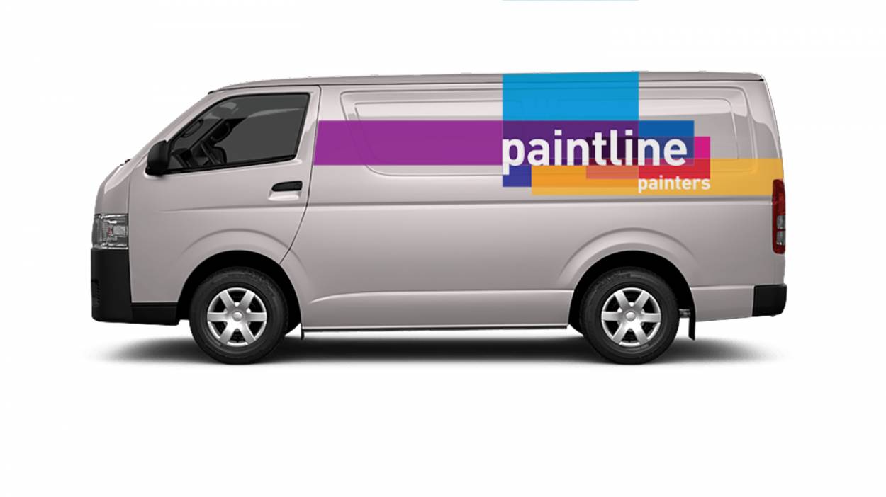
The idea of using overlapping colours reflects a painter building colour with multiple layers of paint. The only difference is that the layers in the identity multiply colours. This also helps paint a picture, pardon the pun, that Paintline always do a complete job. They infer that Paintlines’ painters paint right into the corners and the geometric lines reinforce the idea of a thorough and precise job. The logo itself can be extended from any side to extend the design across any given piece of collateral. The colours remain consistent to build brand recognition, and the fluidity in the design gives the designer and the viewer something more interesting.
The idea of using overlapping colours reflects a painter building colour with multiple layers of paint. The only difference is that the layers in the identity multiply colours. This also helps paint a picture, pardon the pun, that Paintline always do a complete job. They infer that Paintlines’ painters paint right into the corners and the geometric lines reinforce the idea of a thorough and precise job. The logo itself can be extended from any side to extend the design across any given piece of collateral. The colours remain consistent to build brand recognition, and the fluidity in the design gives the designer and the viewer something more interesting.
The idea of using overlapping colours reflects a painter building colour with multiple layers of paint. The only difference is that the layers in the identity multiply colours. This also helps paint a picture, pardon the pun, that Paintline always do a complete job. They infer that Paintlines’ painters paint right into the corners and the geometric lines reinforce the idea of a thorough and precise job. The logo itself can be extended from any side to extend the design across any given piece of collateral. The colours remain consistent to build brand recognition, and the fluidity in the design gives the designer and the viewer something more interesting.
Each of these case studies illustrates how I approach brand identity as a collaborative and client-focused process. From small businesses to larger organisations, each brand design reflects the unique goals and personalities of the clients. I create designs through careful consideration of the brand’s values and audience and delivers identities that are not only memorable and enduring.
Each of these case studies illustrates how I approach brand identity as a collaborative and client-focused process. From small businesses to larger organisations, each brand design reflects the unique goals and personalities of the clients. I create designs through careful consideration of the brand’s values and audience and delivers identities that are not only memorable and enduring.
Each of these case studies illustrates how I approach brand identity as a collaborative and client-focused process. From small businesses to larger organisations, each brand design reflects the unique goals and personalities of the clients. I create designs through careful consideration of the brand’s values and audience and delivers identities that are not only memorable and enduring.