Some projects have a less predictable path. Whether it is re-naming or repositioning a brand, helping the client understand who they are and why they do business. Blue sky thinking is all part of the service.
While all design projects revolve around an idea, some require broader and more aspirational thinking. Blue sky thinking is all part of the service.
Cultivate
Web developer Paul Wagstaff was building his business aimed at small to medium businesses that needed a website with sound SEO. We were considering a name change; at the time, his business was called Tyranny. Working with the client to rename the company Cultivate was the prime choice. It researched well with clients and was a favourite of the client.
“Well, I guess you’ll be designing a logo with a plant then…”
“Well, I guess you’ll be designing a logo with a plant then…”
“Well, I guess you’ll be designing a logo with a plant then…”
“Well, I guess you’ll be designing a logo with a plant then,” was the response from the client when we decided Cultivate would be the new name for his company. So, there was the challenge, design an identity that didn’t include a plant.
“Well, I guess you’ll be designing a logo with a plant then,” was the response from the client when we decided Cultivate would be the new name for his company. So, there was the challenge, design an identity that didn’t include a plant.
“Well, I guess you’ll be designing a logo with a plant then,” was the response from the client when we decided Cultivate would be the new name for his company. So, there was the challenge, design an identity that didn’t include a plant.
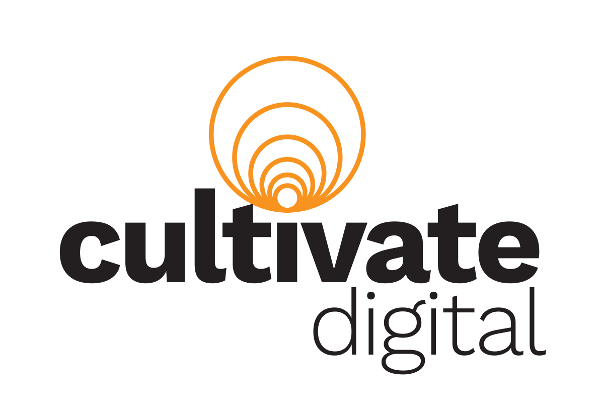
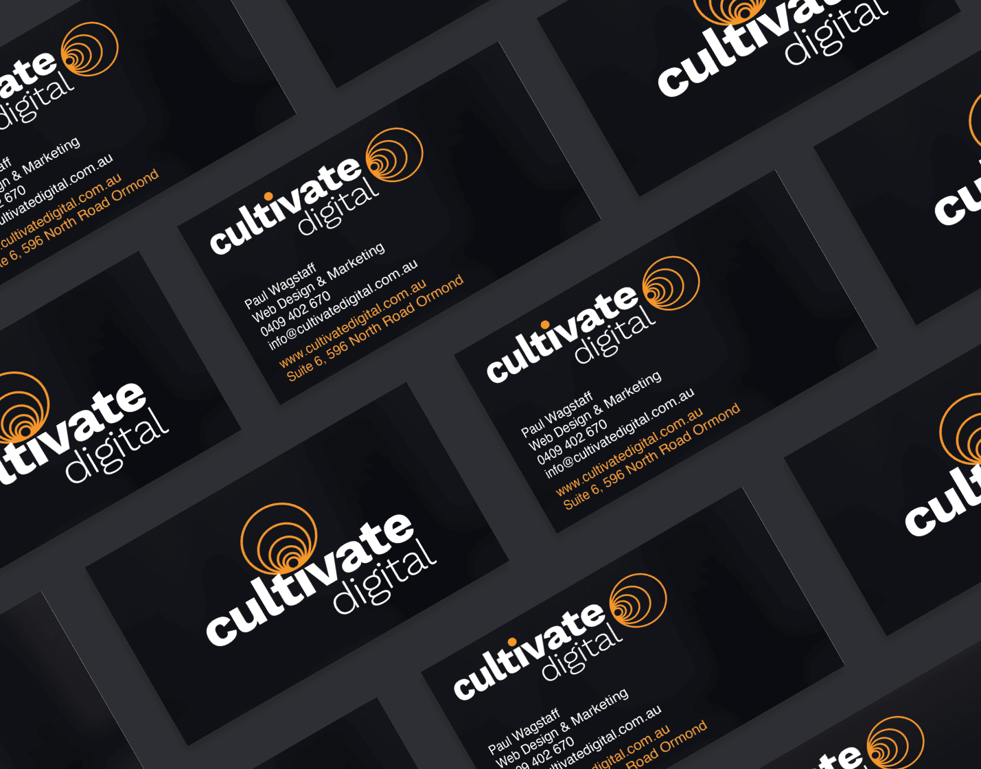
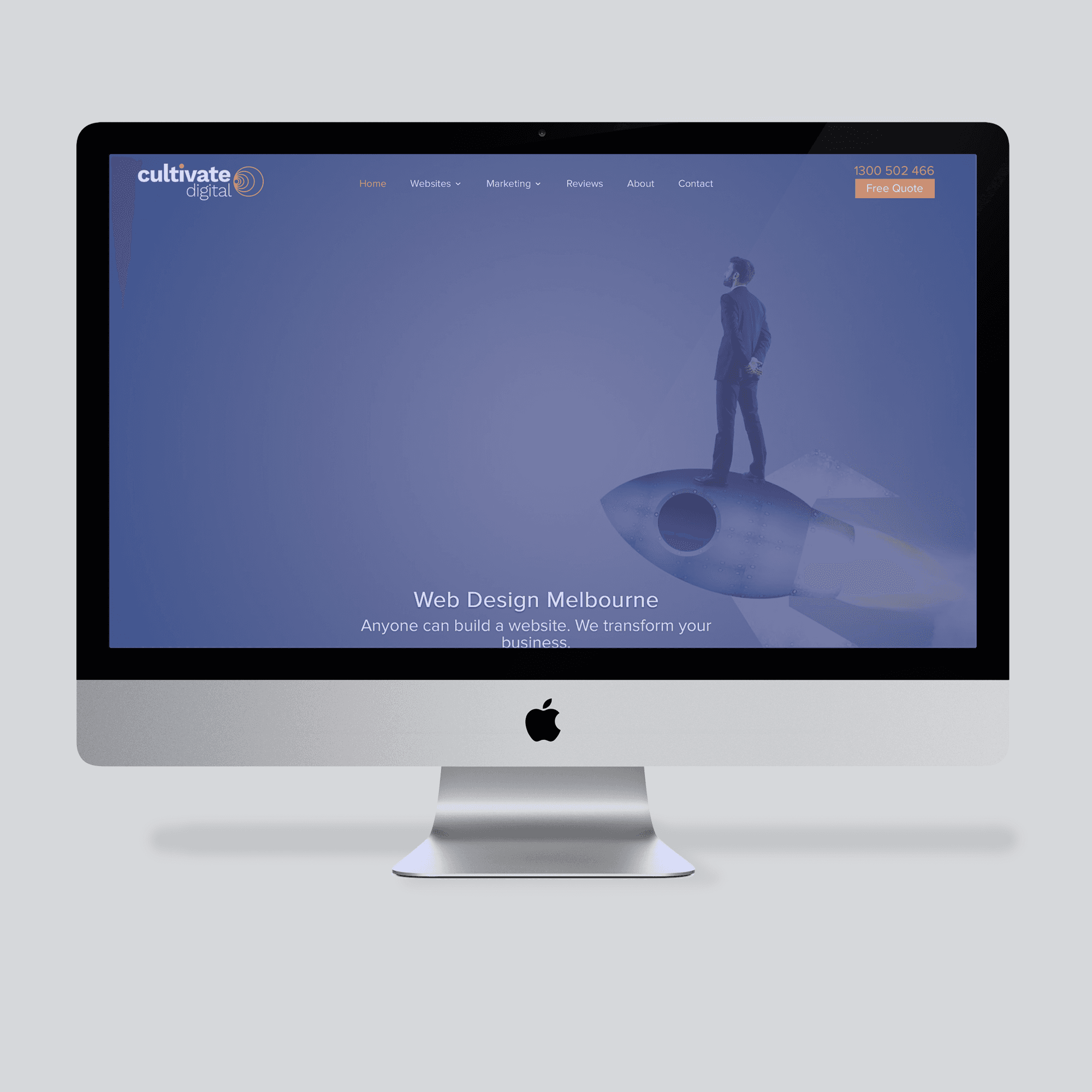
Faced with the challenge to avoid using plants, my thinking moved to the purpose of the business. The prime offering of the company was to design websites that would grow their clients’ businesses. Design solutions were created around ideas related to building awareness or spheres of influence. The chosen design is based on radiating arcs related to online connections and ever-increasing circles. To help visualise the message, an animated logo was designed for use online.
Faced with the challenge to avoid using plants, my thinking moved to the purpose of the business. The prime offering of the company was to design websites that would grow their clients’ businesses. Design solutions were created around ideas related to building awareness or spheres of influence. The chosen design is based on radiating arcs related to online connections and ever-increasing circles. To help visualise the message, an animated logo was designed for use online.
Faced with the challenge to avoid using plants, my thinking moved to the purpose of the business. The prime offering of the company was to design websites that would grow their clients’ businesses. Design solutions were created around ideas related to building awareness or spheres of influence. The chosen design is based on radiating arcs related to online connections and ever-increasing circles. To help visualise the message, an animated logo was designed for use online.
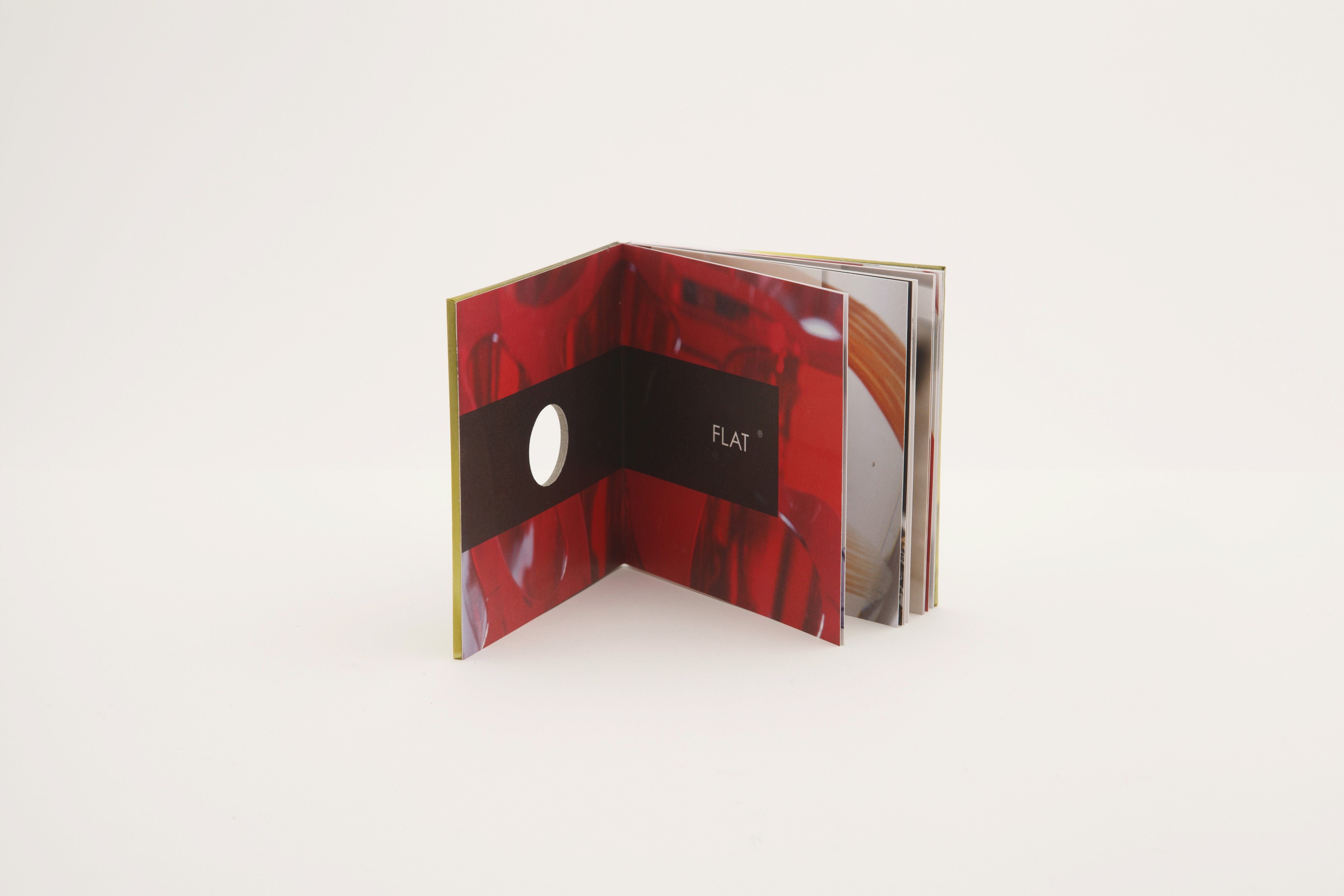
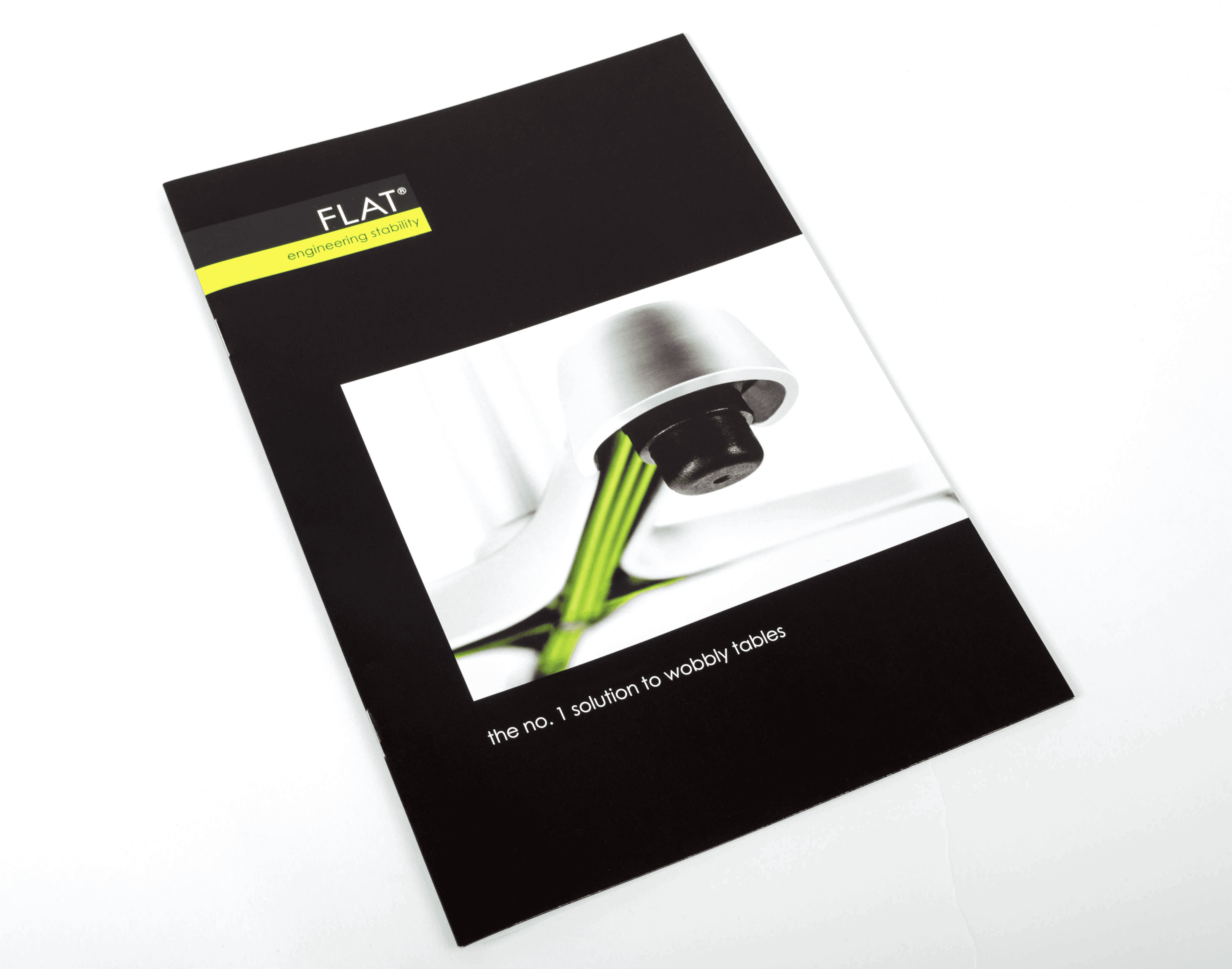
FLAT
FLAT is a revolutionary system for self-levelling furniture. It uses fluids to push rubber feet down to the ground depending on the pressure applied to the legs on a piece of furniture. FLAT is a system that levels furniture no matter the surface; furniture fitted with the FLAT system will not wobble.

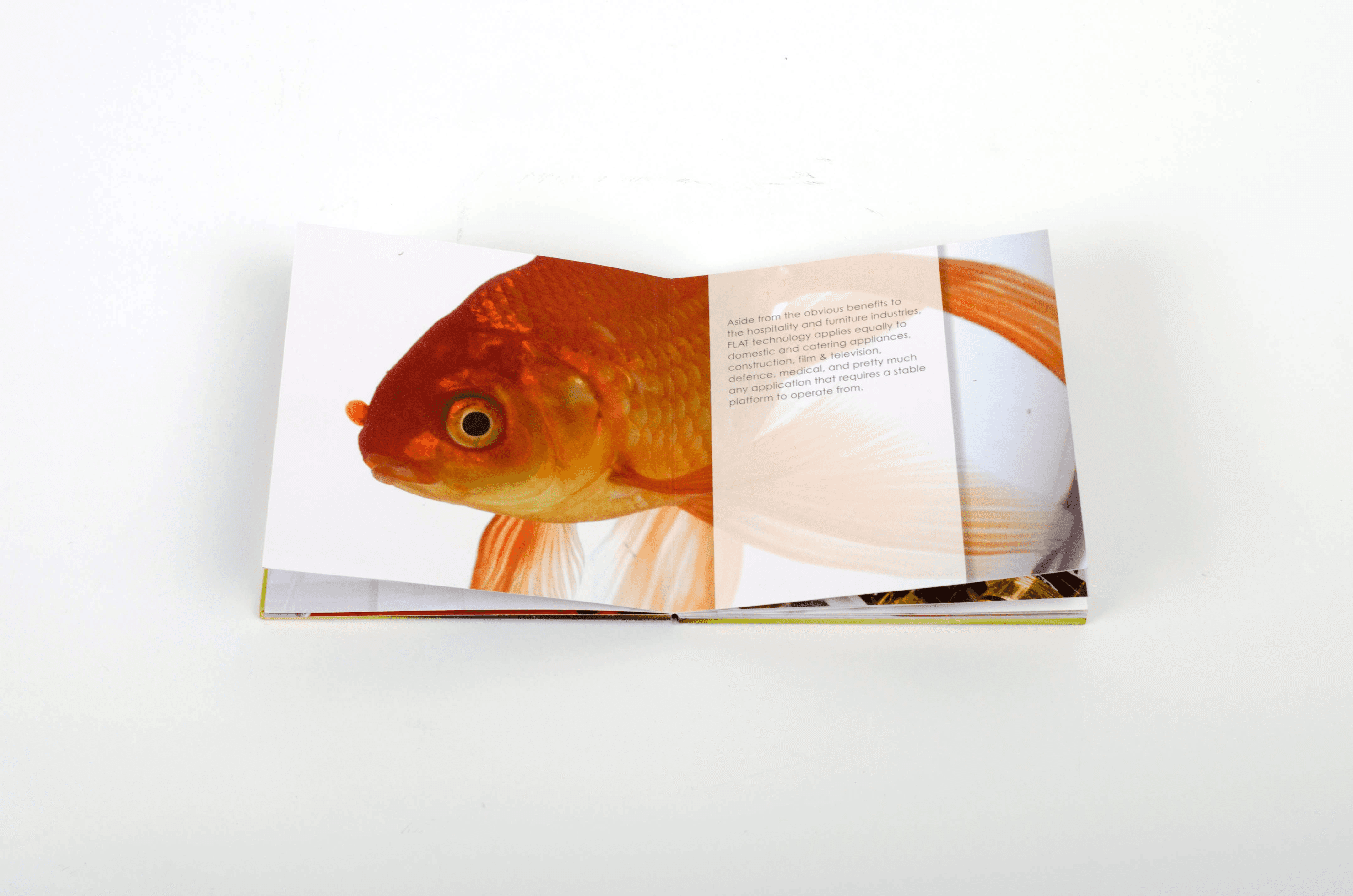
To promote their system when presenting to furniture manufacturers, they required a memorable leave-behind that portrayed the essence of their product. It would given to prospective clients after their first meeting with FLAT.
To promote their system when presenting to furniture manufacturers, they required a memorable leave-behind that portrayed the essence of their product. It would given to prospective clients after their first meeting with FLAT.
To promote their system when presenting to furniture manufacturers, they required a memorable leave-behind that portrayed the essence of their product. It would given to prospective clients after their first meeting with FLAT.
“The idea was to depict the benefit of having FLAT installed in your furniture.”
“The idea was to depict the benefit of having FLAT installed in your furniture.”
“The idea was to depict the benefit of having FLAT installed in your furniture.”
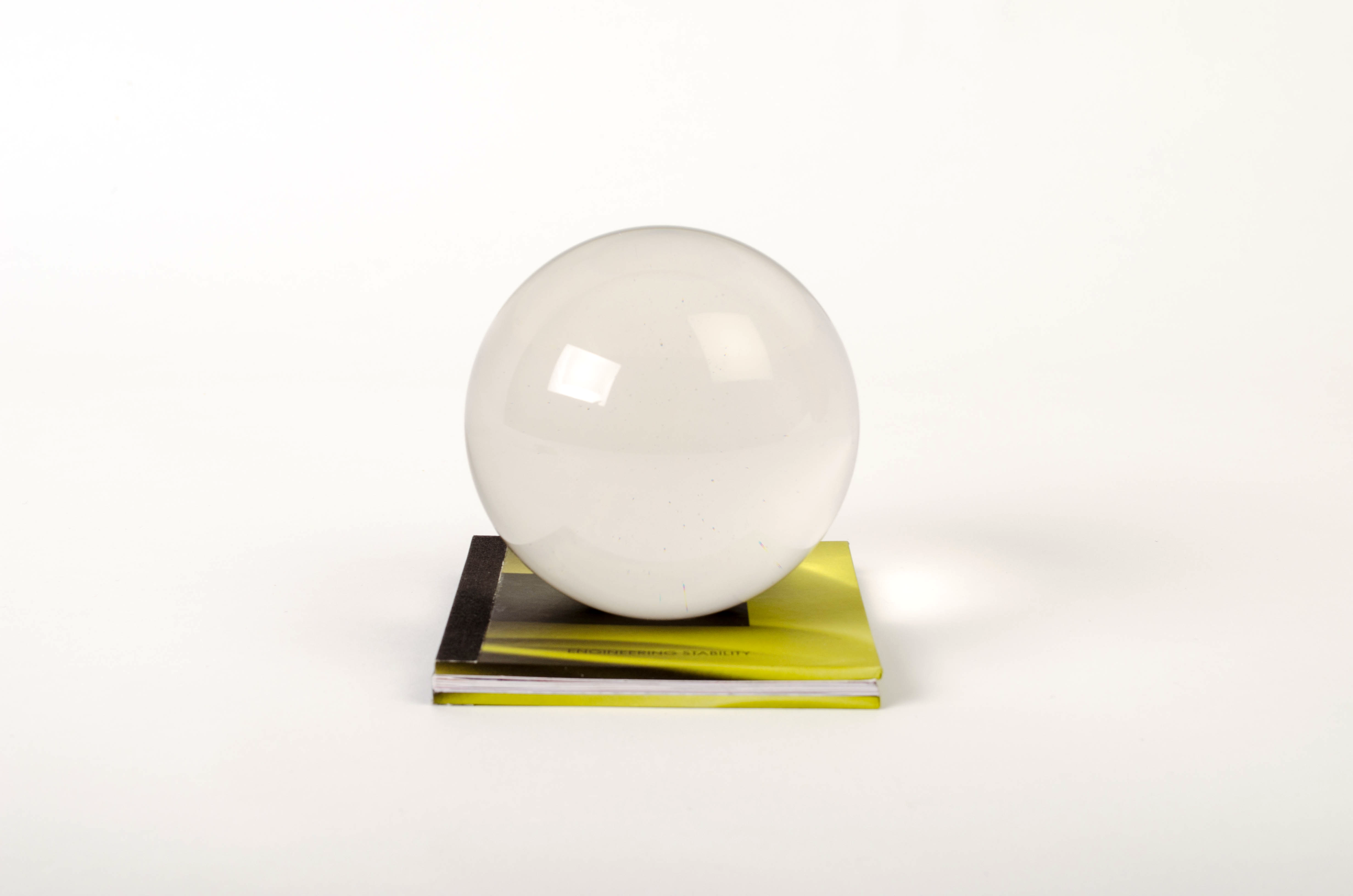
The idea was to depict the benefit of having FLAT installed in your furniture. Firstly, the brochure is the size of a beer coaster. The clear ball sits within a die cut in the front cover of a hardcover book made from coaster material. Whilst on the cover of the book it remains perfectly stable. Once removed, the ball is unpredictable and difficult to keep still. Therefore, to keep the glass ball under control, you need the engineered stability of FLAT to create your stable foundation.
The idea was to depict the benefit of having FLAT installed in your furniture. Firstly, the brochure is the size of a beer coaster. The clear ball sits within a die cut in the front cover of a hardcover book made from coaster material. Whilst on the cover of the book it remains perfectly stable. Once removed, the ball is unpredictable and difficult to keep still. Therefore, to keep the glass ball under control, you need the engineered stability of FLAT to create your stable foundation.
The idea was to depict the benefit of having FLAT installed in your furniture. Firstly, the brochure is the size of a beer coaster. The clear ball sits within a die cut in the front cover of a hardcover book made from coaster material. Whilst on the cover of the book it remains perfectly stable. Once removed, the ball is unpredictable and difficult to keep still. Therefore, to keep the glass ball under control, you need the engineered stability of FLAT to create your stable foundation.
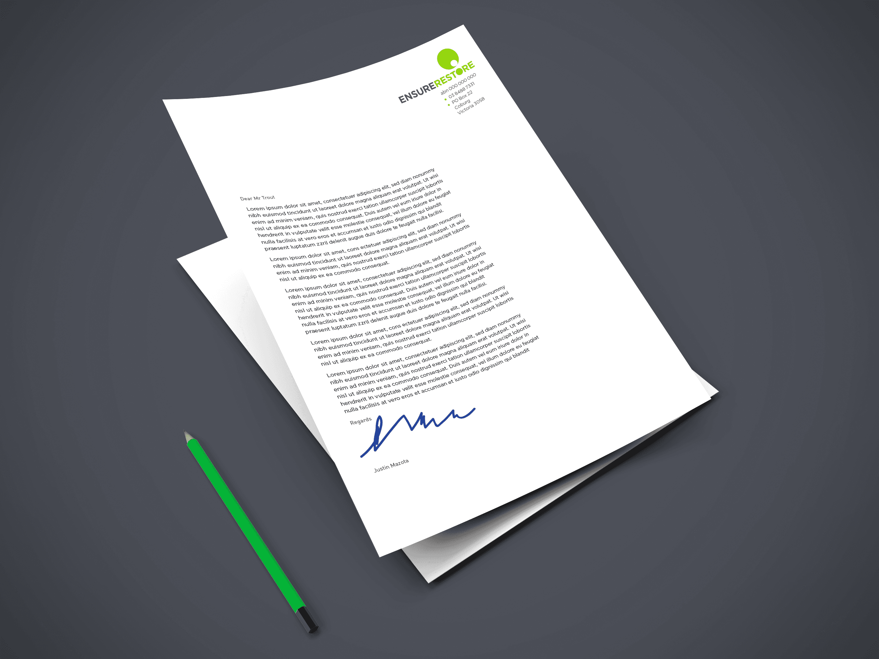
Ensure Restore
As well as renaming and rebranding, I reposition businesses. Owner Justin Mazotta was looking for a brand identity that avoided the obvious. His business specialised in insurance repair projects. His current business name was ColourSmart. He had started life as a painter and was moving into the insurance building space. However, his company name and identity bore no link to where his business was heading. Working with the client, we created lists of words that could fit.
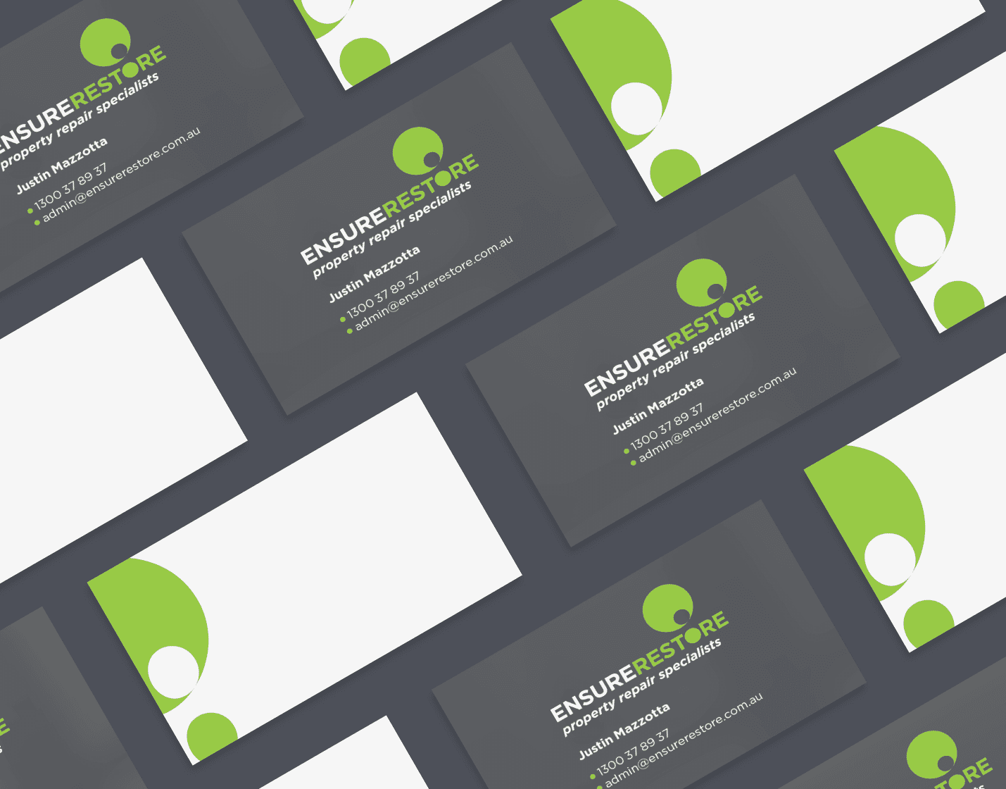
The identity needed to say don’t stress we are here to help. ColourSmart already had a presence, so we kept the colours from their existing identity.
The identity needed to say don’t stress we are here to help. ColourSmart already had a presence, so we kept the colours from their existing identity.
The identity needed to say don’t stress we are here to help. ColourSmart already had a presence, so we kept the colours from their existing identity.
Once the design phase of the project started, we wanted to project an air of calm. While insurance restoration projects can be testing, we wanted the customer to not feel panic and hysterical reactions to what could have been a traumatic period in their life. A series of design solutions were presented. All of them had a positive aspect to them. In the chosen design, the icon represents the client’s life; the hole is the hole in their life while they wait for they wait for the work to be done. The solid O in the brand name represents Ensure Restore’s work to fill that hole.
Once the design phase of the project started, we wanted to project an air of calm. While insurance restoration projects can be testing, we wanted the customer to not feel panic and hysterical reactions to what could have been a traumatic period in their life. A series of design solutions were presented. All of them had a positive aspect to them. In the chosen design, the icon represents the client’s life; the hole is the hole in their life while they wait for they wait for the work to be done. The solid O in the brand name represents Ensure Restore’s work to fill that hole.
Once the design phase of the project started, we wanted to project an air of calm. While insurance restoration projects can be testing, we wanted the customer to not feel panic and hysterical reactions to what could have been a traumatic period in their life. A series of design solutions were presented. All of them had a positive aspect to them. In the chosen design, the icon represents the client’s life; the hole is the hole in their life while they wait for they wait for the work to be done. The solid O in the brand name represents Ensure Restore’s work to fill that hole.
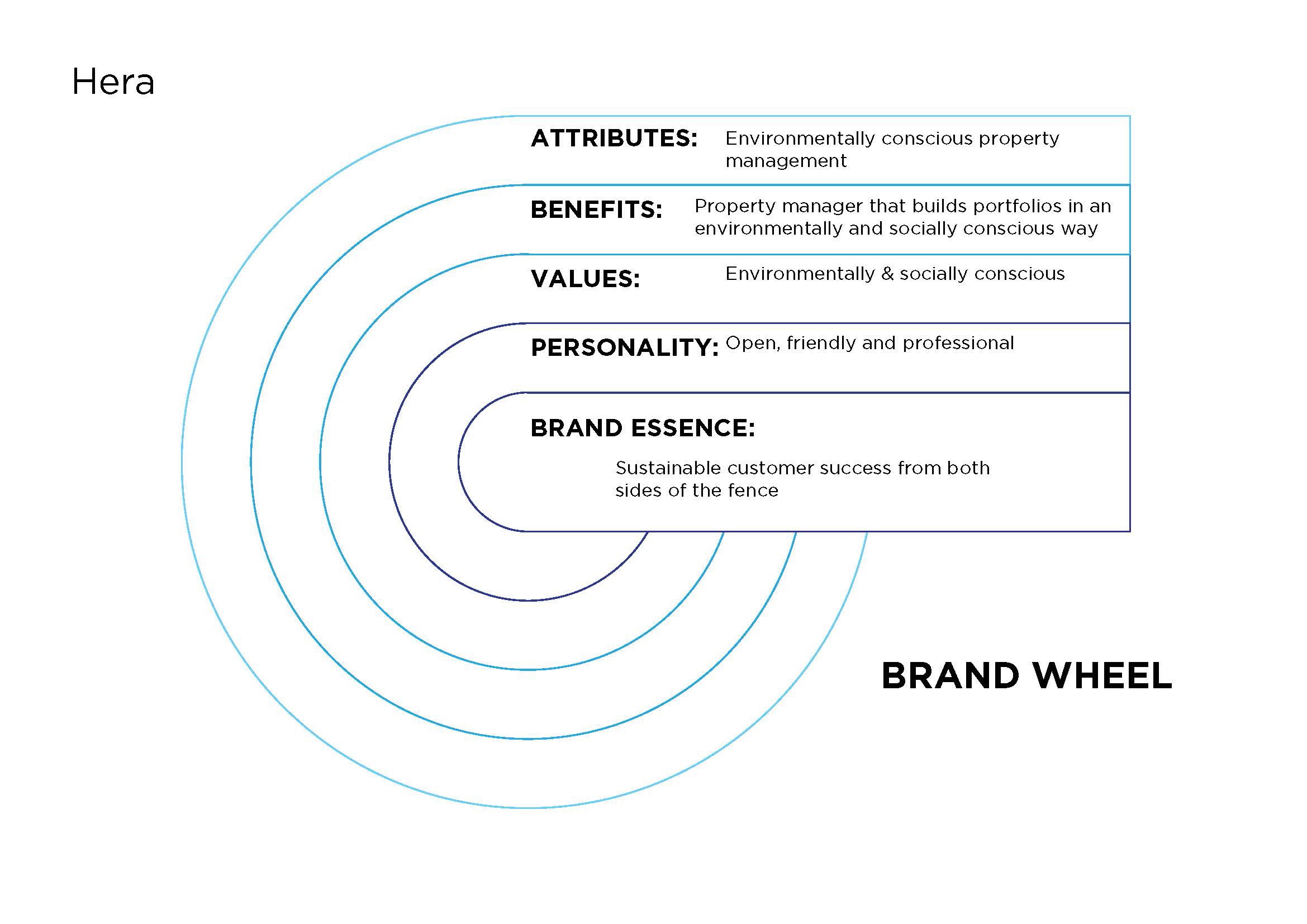
Hera
Hera Property Management is an environmentally conscious property manager that builds portfolios in an environmentally and socially conscious way. They had a logo, a very rigid design. The design didn’t fit with the client’s vision for their brand. Hera was part of a suite of companies. A parent company, Ecolity, three other sub-brands, and Hera. All were disparate and didn’t relate visually or in application.
Firstly, an overall voice for the brands needed to be created. Update Hera Property Management’s brand identity to fit its ethos and market positioning better. Create a design that could work with its parent company and sub-brands. Then, create a visual identity to work across all the brands.
Firstly, an overall voice for the brands needed to be created. Update Hera Property Management’s brand identity to fit its ethos and market positioning better. Create a design that could work with its parent company and sub-brands. Then, create a visual identity to work across all the brands.
Firstly, an overall voice for the brands needed to be created. Update Hera Property Management’s brand identity to fit its ethos and market positioning better. Create a design that could work with its parent company and sub-brands. Then, create a visual identity to work across all the brands.
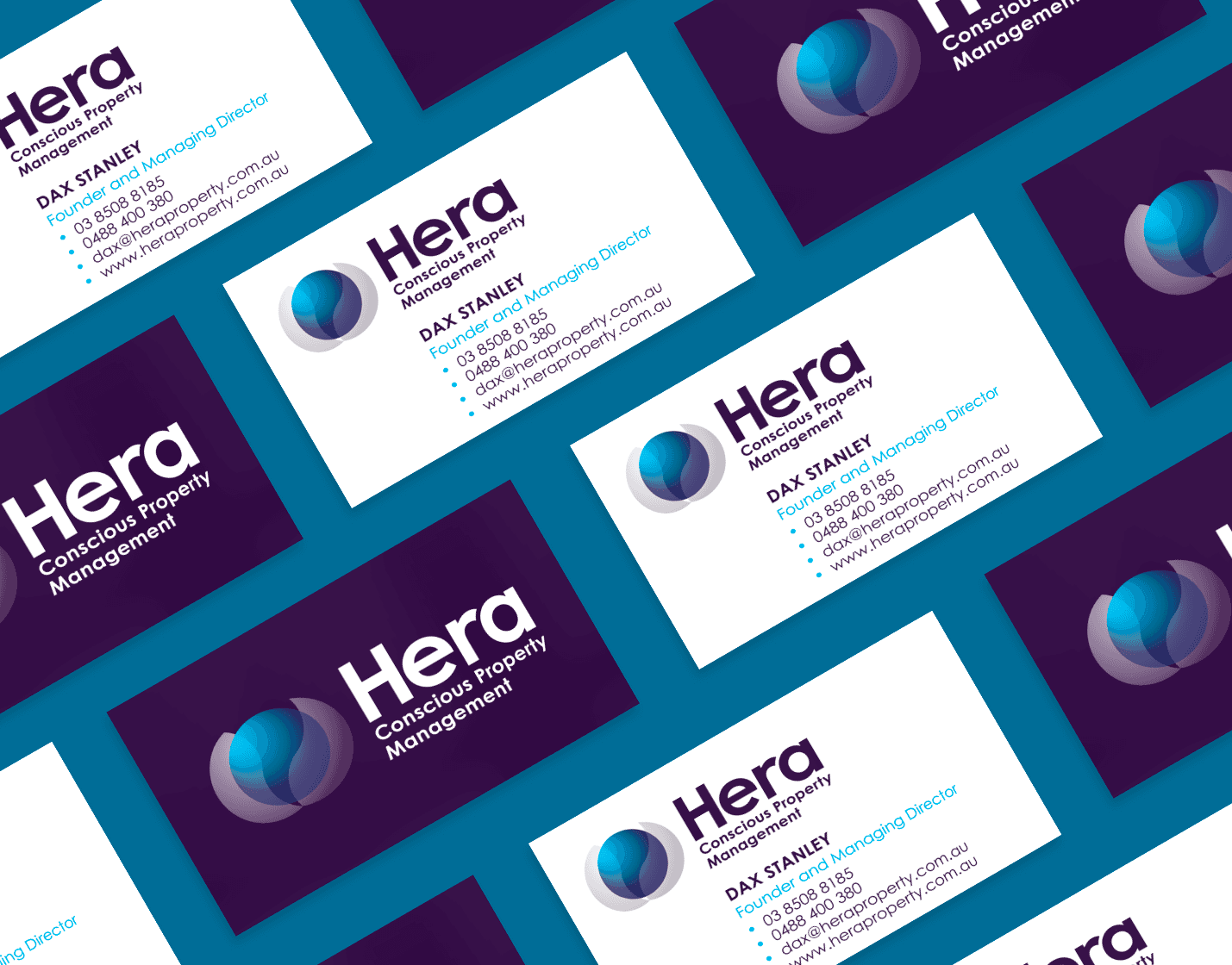
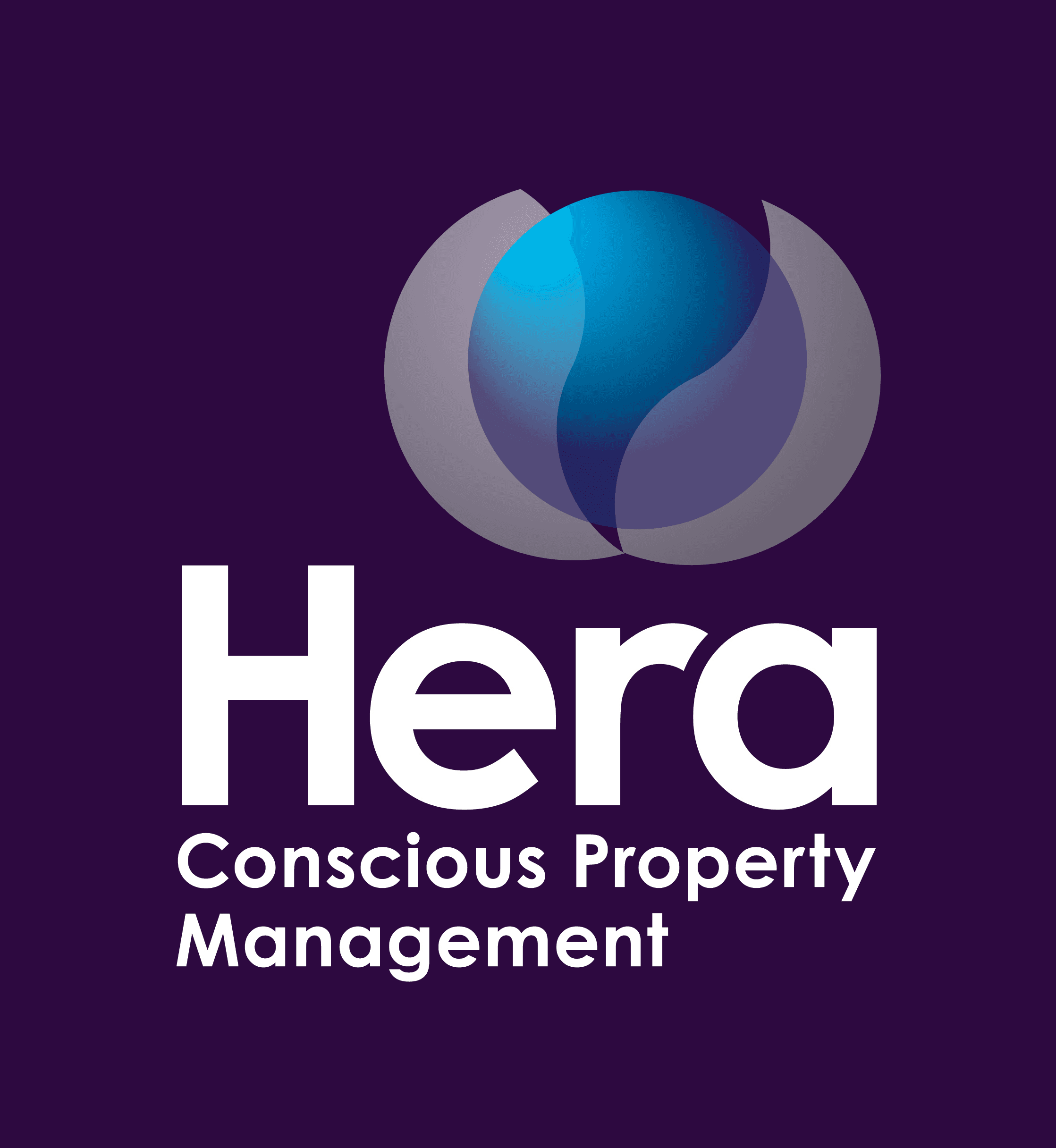
For each company, a clear understanding of each brand’s role, target audience, brand essence, and brand character was developed. Then, a positioning matrix and brand character were built from the previous studies. The symbol represents birth or emerging from a shell. Breaking out of an old skin and evolving into a new one. The sphere represents our beautiful blue planet emerging into a new world and a new way of thinking. This represents Hera’s new and different approach to property management. The type is modern and open; the colour is business-like and trustworthy.
For each company, a clear understanding of each brand’s role, target audience, brand essence, and brand character was developed. Then, a positioning matrix and brand character were built from the previous studies. The symbol represents birth or emerging from a shell. Breaking out of an old skin and evolving into a new one. The sphere represents our beautiful blue planet emerging into a new world and a new way of thinking. This represents Hera’s new and different approach to property management. The type is modern and open; the colour is business-like and trustworthy.
For each company, a clear understanding of each brand’s role, target audience, brand essence, and brand character was developed. Then, a positioning matrix and brand character were built from the previous studies. The symbol represents birth or emerging from a shell. Breaking out of an old skin and evolving into a new one. The sphere represents our beautiful blue planet emerging into a new world and a new way of thinking. This represents Hera’s new and different approach to property management. The type is modern and open; the colour is business-like and trustworthy.
Other blue sky projects include repositioning clients’ businesses, renamed companies, and helping creative companies build their structural organisation.
Other blue sky projects include repositioning clients’ businesses, renamed companies, and helping creative companies build their structural organisation.
Other blue sky projects include repositioning clients’ businesses, renamed companies, and helping creative companies build their structural organisation.
As well as smaller brands, I have worked with large organisations like Nestlé on ideation sessions to create packaging solutions to solve a wide range of issues like usability, environmental impact, and branding capabilities. These two-day design sprints involved design teams, suppliers and marketing personnel brainstorming individual design solutions and collaboration between divergent disciplines.
As well as smaller brands, I have worked with large organisations like Nestlé on ideation sessions to create packaging solutions to solve a wide range of issues like usability, environmental impact, and branding capabilities. These two-day design sprints involved design teams, suppliers and marketing personnel brainstorming individual design solutions and collaboration between divergent disciplines.
As well as smaller brands, I have worked with large organisations like Nestlé on ideation sessions to create packaging solutions to solve a wide range of issues like usability, environmental impact, and branding capabilities. These two-day design sprints involved design teams, suppliers and marketing personnel brainstorming individual design solutions and collaboration between divergent disciplines.